Case Study
BandMate
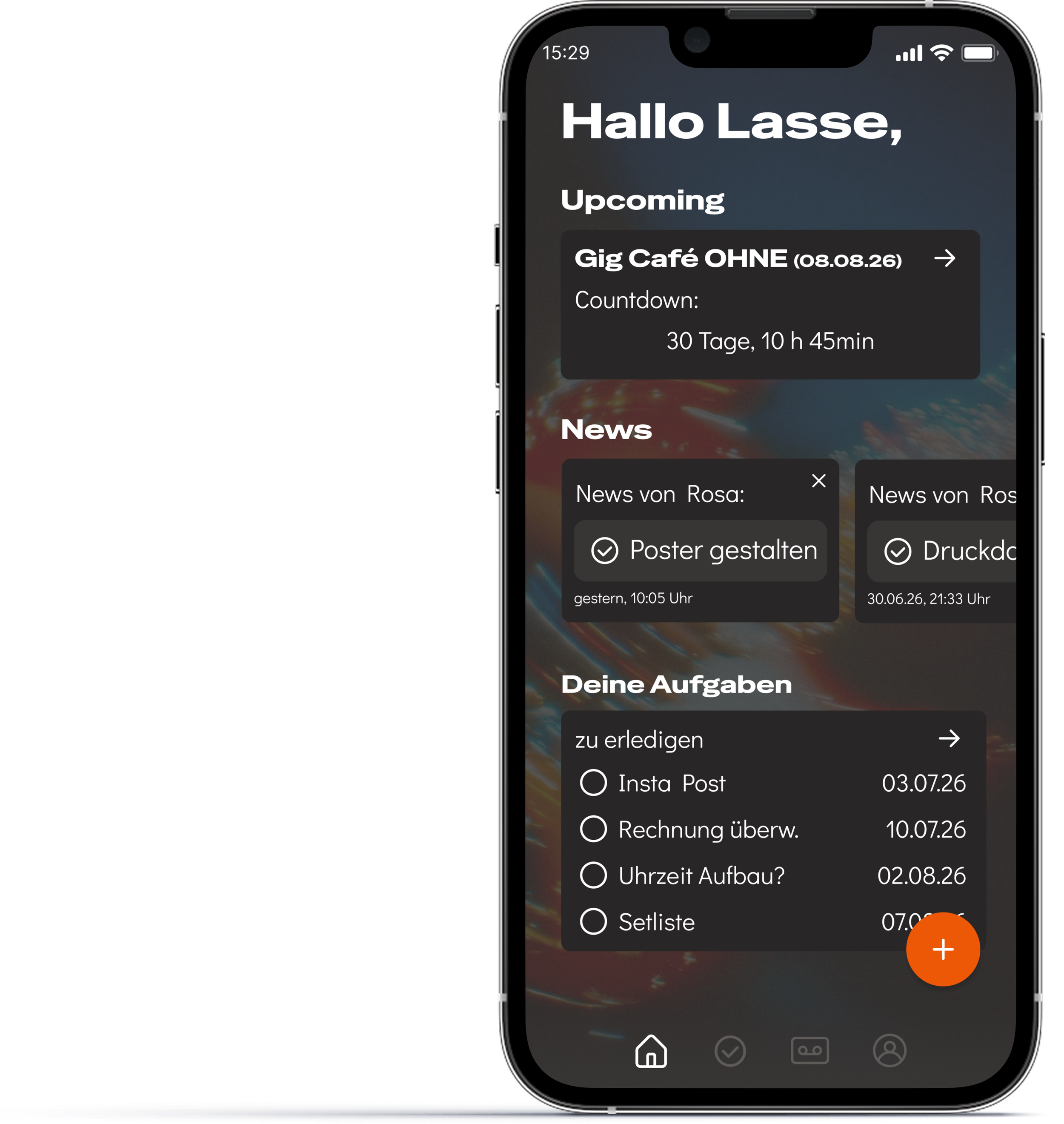
The day starts with what matters most: a countdown to the next gig, a feed of what the band just finished, and a personal list of what's still open. Nothing here needs to be dug out of a chat history, it's just there.
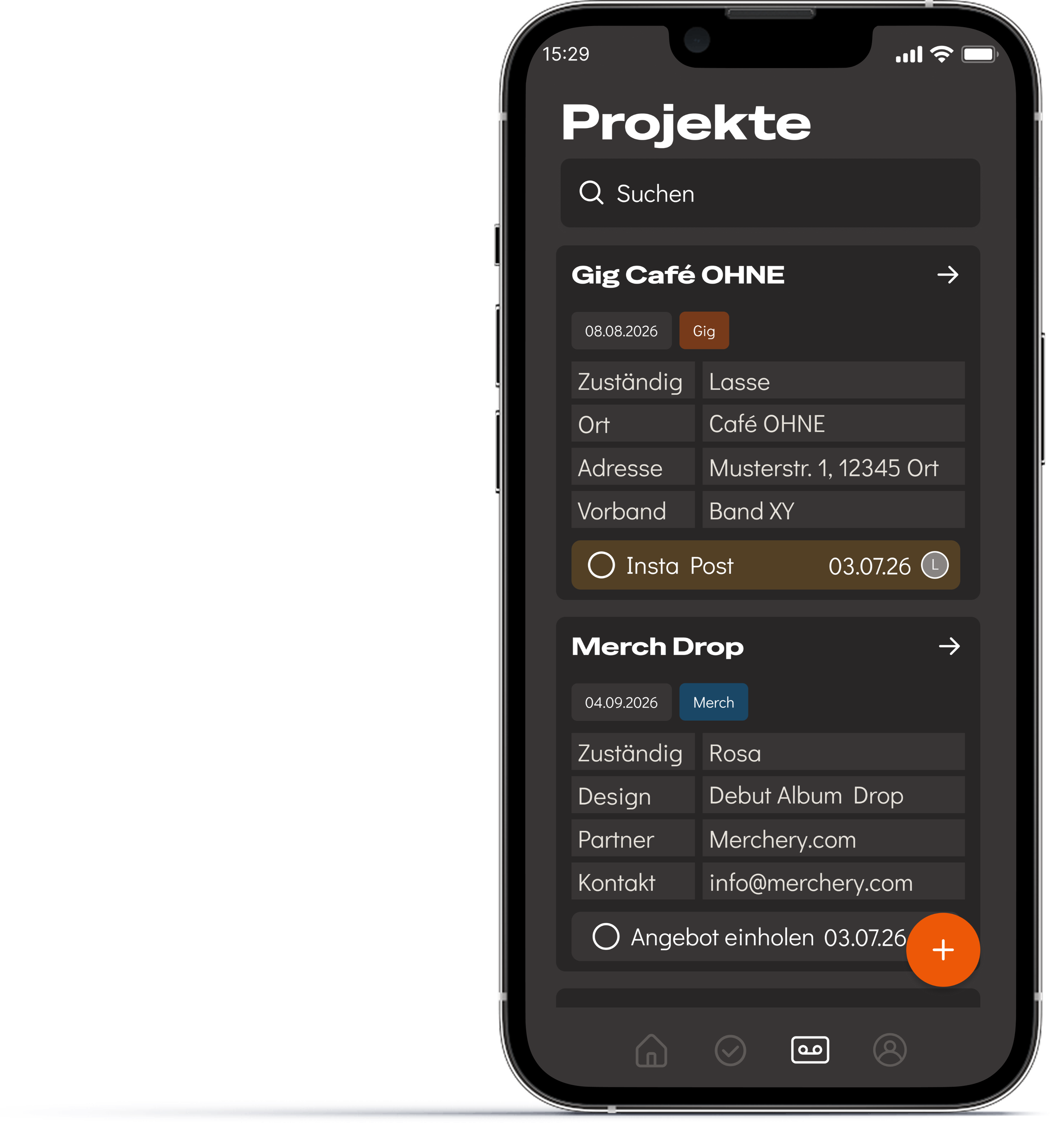
Every gig and project the band is working on, in one searchable list. Each entry shows who's responsible and what's next, so a member can check status without opening a group chat or asking around.
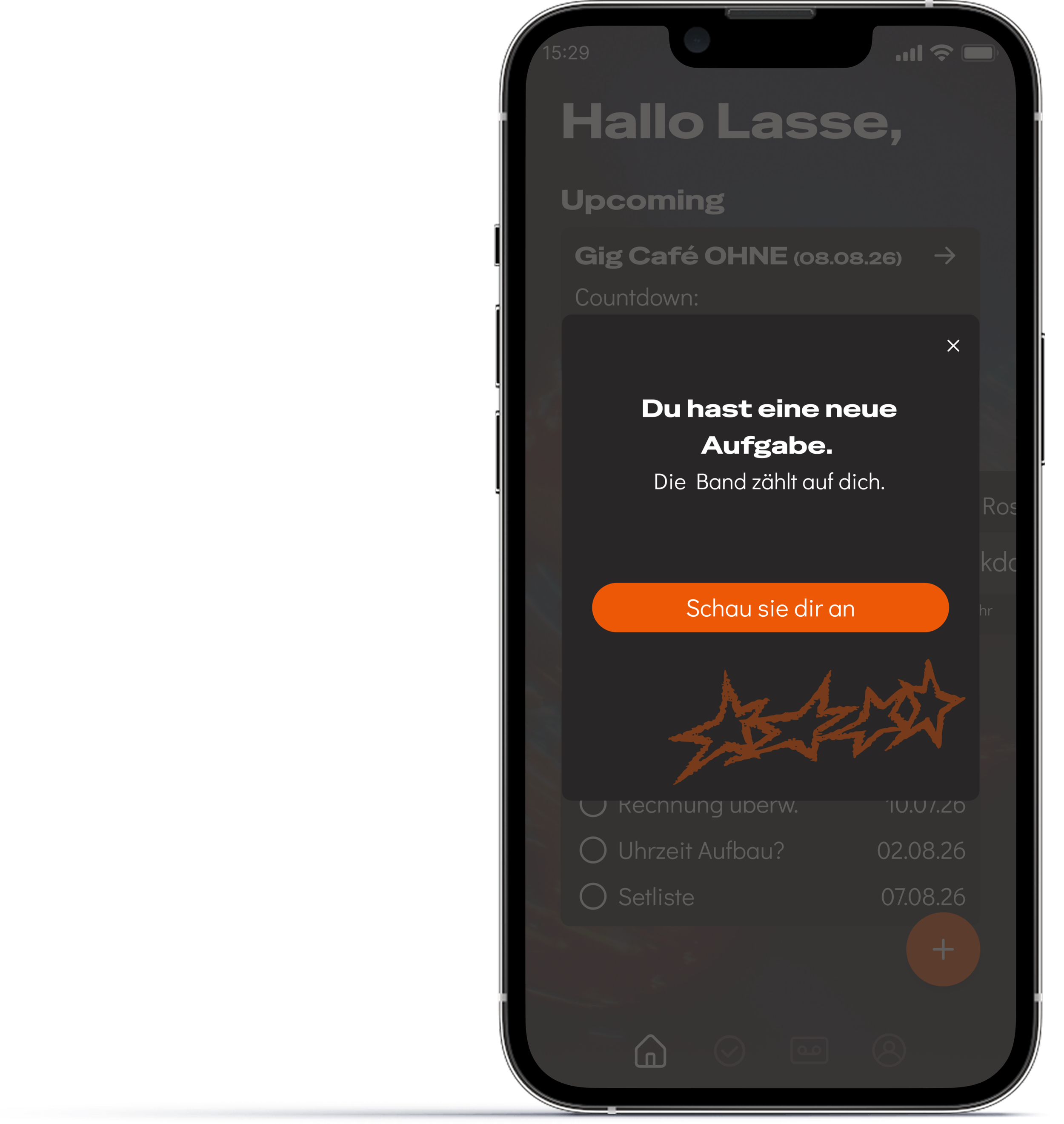
The moment a task gets assigned, the member finds out directly, not through a message that might get buried. No one has to check in to know what's theirs.
Testing & iteration
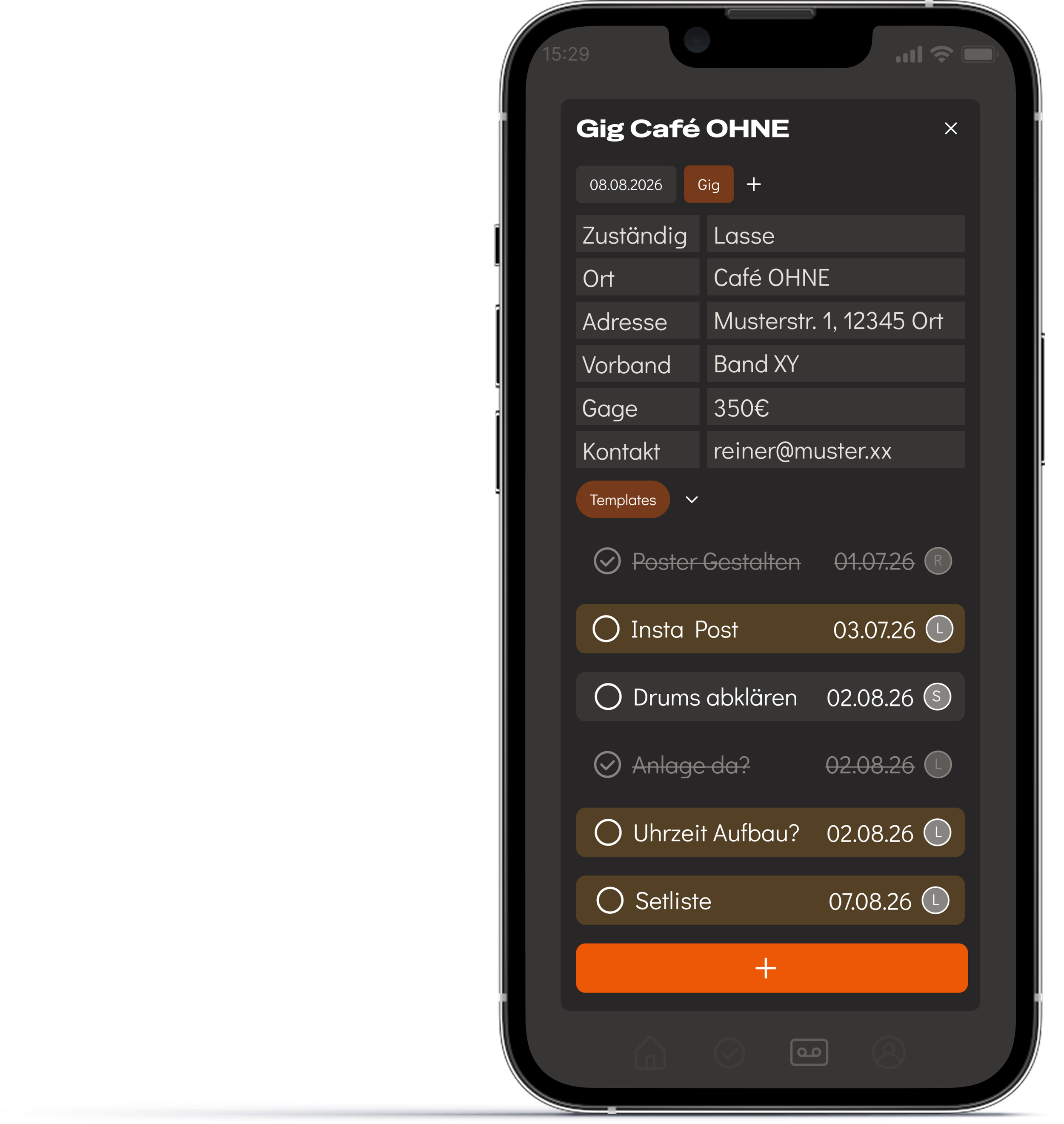
The mid-fi prototype used the same grayscale system for every task, regardless of who it was assigned to. In testing, this was the single most confusing part of the flow: testers couldn't tell at a glance which tasks were theirs without reading each row.
For the hi-fi version, a member's own tasks are highlighted in color, while everyone else's stay neutral. Status is still shown separately, through a checkmark and strikethrough, so it never depends on color alone.
Both testers picked up the difference immediately and completed the task without hesitation, a clear improvement over the confusion the grayscale version caused.
Navigation was the other friction point. Both testers found their way around once they'd clicked through the app once, but that first pass took longer than it should have.
In response, I added a short onboarding tutorial that runs on first login, walking through the main navigation before the user is on their own. It hasn't been tested yet, but it's built into the prototype below.
The full flow is live in Figma, including the onboarding tutorial: view prototype